
Components
Form
(28)
AutoComplete
AutoComplete is an input component that provides real-time suggestions when being typed.

CascadeSelect
CascadeSelect is a form component to select a value from a nested structure of options.

Checkbox
Checkbox is an extension to standard checkbox element with theming.

DatePicker
DatePicker is a form component to work with dates.

FloatLabel
FloatLabel visually integrates a label with its form element.

IconField
IconField wraps an input and an icon.

IftaLabel
IftaLabel visually integrates a label with its form element.
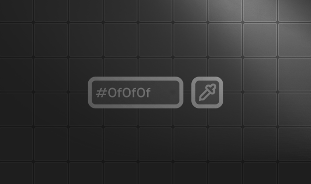
InputColor
InputColor is a component that allows the user to select a color.

InputGroup
InputGroup displays text, icon, buttons and other content can be grouped next to an input.
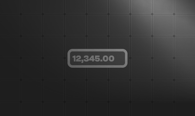
InputNumber
InputNumber is used to enter numeric values.

InputOtp
InputOtp is used to enter one time passwords.
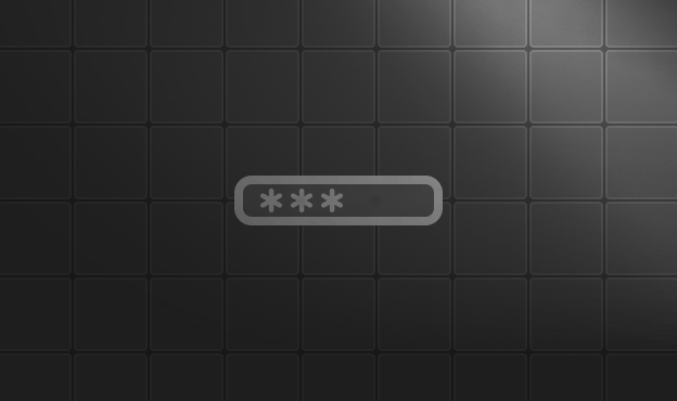
InputPassword
InputPassword is an enhanced input for password entry with strength metering, mask toggling, and controlled or uncontrolled usage.

InputTags
InputTags groups a collection of contents in items.

InputText
InputText is an extension to standard input element with icons and theming.
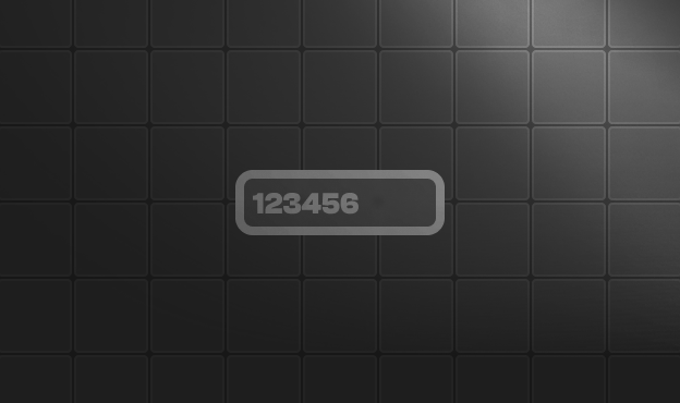
KeyFilter
KeyFilter is used to block individual keystrokes based on a pattern.

Knob
Knob is a form component to define number inputs with a dial.
Label
Label provides accessible text labels for form controls. Use `htmlFor` to link the label to a form control by its id.

Listbox
Listbox is used to select one or more values from a list of items.

Mask
Mask is a directive used to enter input in a certain format such as numeric, date, currency, email and phone.

RadioButton
RadioButton is an extension to standard radio button element with theming.

Rating
Rating component is a star based selection input.

Select
Select is used to choose an item from a collection of options.

SelectButton
SelectButton is used to choose single or multiple items from a list using buttons.

Slider
Slider is a component to provide input with a drag handle.
Textarea
Textarea is a multi-line text input element.

ToggleButton
ToggleButton component is used to create a button that can be toggled on or off.
ToggleSwitch
ToggleSwitch is used to select a boolean value.

TreeSelect
TreeSelect is a form component to choose from hierarchical data.
Button
(3)

Data
(10)
DataTable
DataTable displays data in tabular format with sorting, filtering, pagination and selection features.
DataView
DataView displays data in grid or list layout with pagination and sorting features.

OrderList
OrderList is used to reorder items in a list using selection and drag-drop.
OrgChart
OrgChart visualizes hierarchical organization data.
Paginator
Paginator displays data in paged format and provides navigation between pages.
PickList
PickList is used to transfer items between two lists with drag-drop and button controls.
Timeline
Timeline visualizes a series of chained events.
Tree
Tree is used to display hierarchical data.
TreeTable
TreeTable renders hierarchical data with the same feature set as DataTable — sort, filter, pagination, selection, scroll, frozen, resize, reorder, editing, export.

VirtualScroller
VirtualScroller is a performant approach to render large amounts of data efficiently.
Panel
(11)
Accordion
Accordion groups content into collapsible panels.

Card
Card is a flexible container component.
DeferredContent
DeferredContent postpones the loading of content that is initially not in the viewport until it becomes visible on scroll.

Divider
Divider is used to separate contents.

Fieldset
Fieldset is a container component with a legend and optional collapsible content.

Panel
Panel is a container component with optional collapsible content.
ScrollArea
ScrollArea is a cross browser, lightweight and themable alternative to native browser scrollbar.
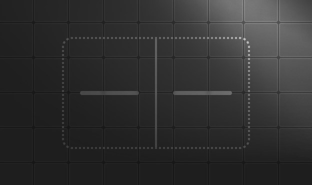
Splitter
Splitter is utilized to separate and resize panels.
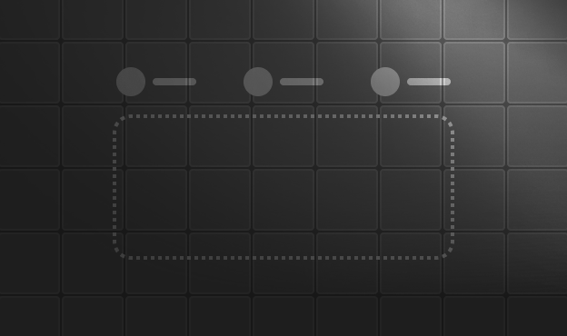
Stepper
The Stepper component displays a wizard-like workflow by guiding users through the multi-step progression.
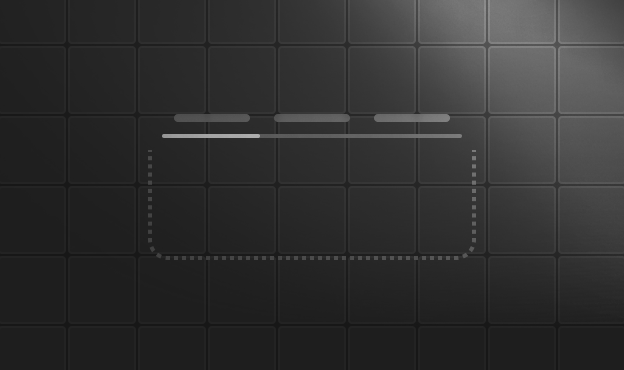
Tabs
Tabs is a component that displays a list of tabs and allows the user to select one.
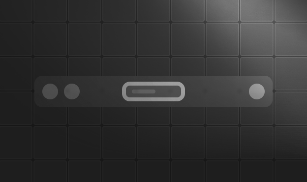
Toolbar
Toolbar is a grouping component for buttons and other content.
Overlay
(7)
ConfirmDialog
ConfirmDialog uses a Dialog UI with confirm method to provide a confirmation.
ConfirmPopup
ConfirmPopup displays a confirmation overlay anchored to a target element.

Dialog
Dialog is a container to display content in an overlay window.

Drawer
Drawer is a panel component displayed as an overlay at the edges of the screen.

DynamicDialog
Dialogs can be created dynamically with any component as the content using a Vue service.

Popover
Popover is an overlay container that displays content relative to a trigger.

Tooltip
Tooltip is a component that displays a tooltip when the user hovers over an element.

Menu
(9)
Breadcrumb
Breadcrumb provides contextual information about page hierarchy.

CommandMenu
CommandMenu is a searchable command palette for keyboard-driven navigation and actions.
ContextMenu
A right-click triggered menu with keyboard navigation, nested submenus, and WAI-ARIA support.
Dock
Dock is a navigation component consisting of menu items.

MegaMenu
MegaMenu is a navigation component that displays submenus together.
Menu
A keyboard-navigable dropdown menu with support for items, checkbox items, radio items, and nested submenus.

Menubar
Menubar is a horizontal menu component.
Sidebar
Sidebar is a layout component for building application navigation with collapsible panels, multi-variant styling, and composable menu structures.

TieredMenu
TieredMenu displays submenus in nested overlays.
Messages
(2)

Media
(3)
Misc
(17)
AnimateOnScroll
AnimateOnScroll applies enter and leave animations to elements as they move in and out of the viewport during scroll.

Avatar
Avatar represents people using icons, labels and images.
Badge
Badge is a small status indicator for another element.

BlockUI
BlockUI can either block other components or the whole page.
Chip
Chip represents entities using icons, labels and images.

Fluid
Fluid is a layout component to make descendant components span full width of their container.
FocusTrap
Focus Trap keeps focus within a certain DOM element while tabbing.
Inplace
Inplace provides an easy to do editing and display at the same time where clicking the output displays the actual content.

MeterGroup
MeterGroup displays scalar measurements within a known range.

ProgressBar
ProgressBar is a process status indicator.

ProgressSpinner
ProgressSpinner is a process status indicator that supports both determinate and indeterminate modes.

Ripple
Ripple directive adds ripple effect to the host element.
ScrollTop
ScrollTop gets displayed after a certain scroll position and used to navigates to the top of the page quickly.

Skeleton
Skeleton is a placeholder to display instead of the actual content.
StyleClass
StyleClass manages CSS classes on a target element with enter/leave animations triggered by user interaction.
Tag
Tag component is used to categorize content.
Terminal
Terminal is a text-based interface component that emulates a command line experience, enabling users to enter commands and receive responses.